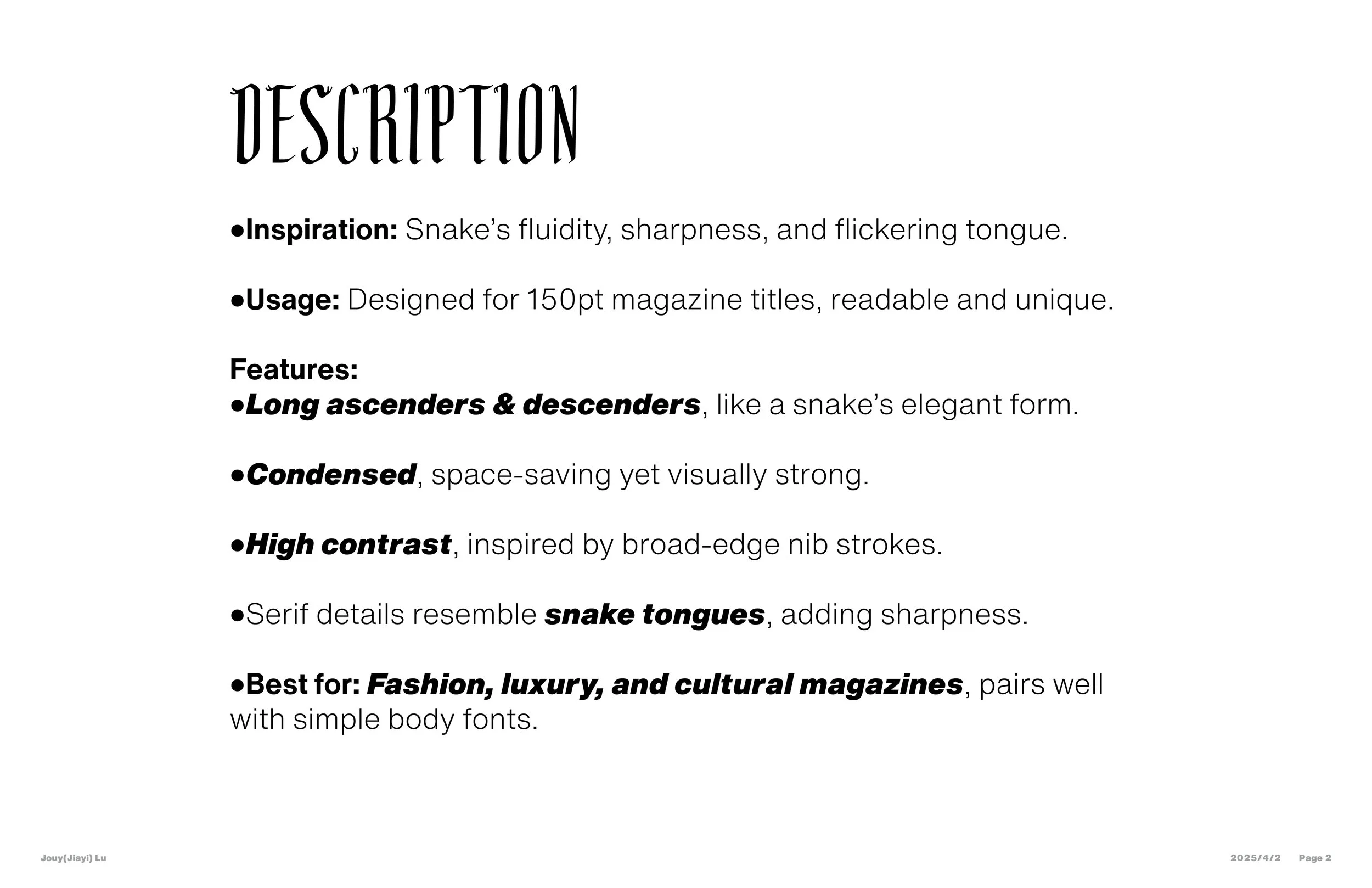
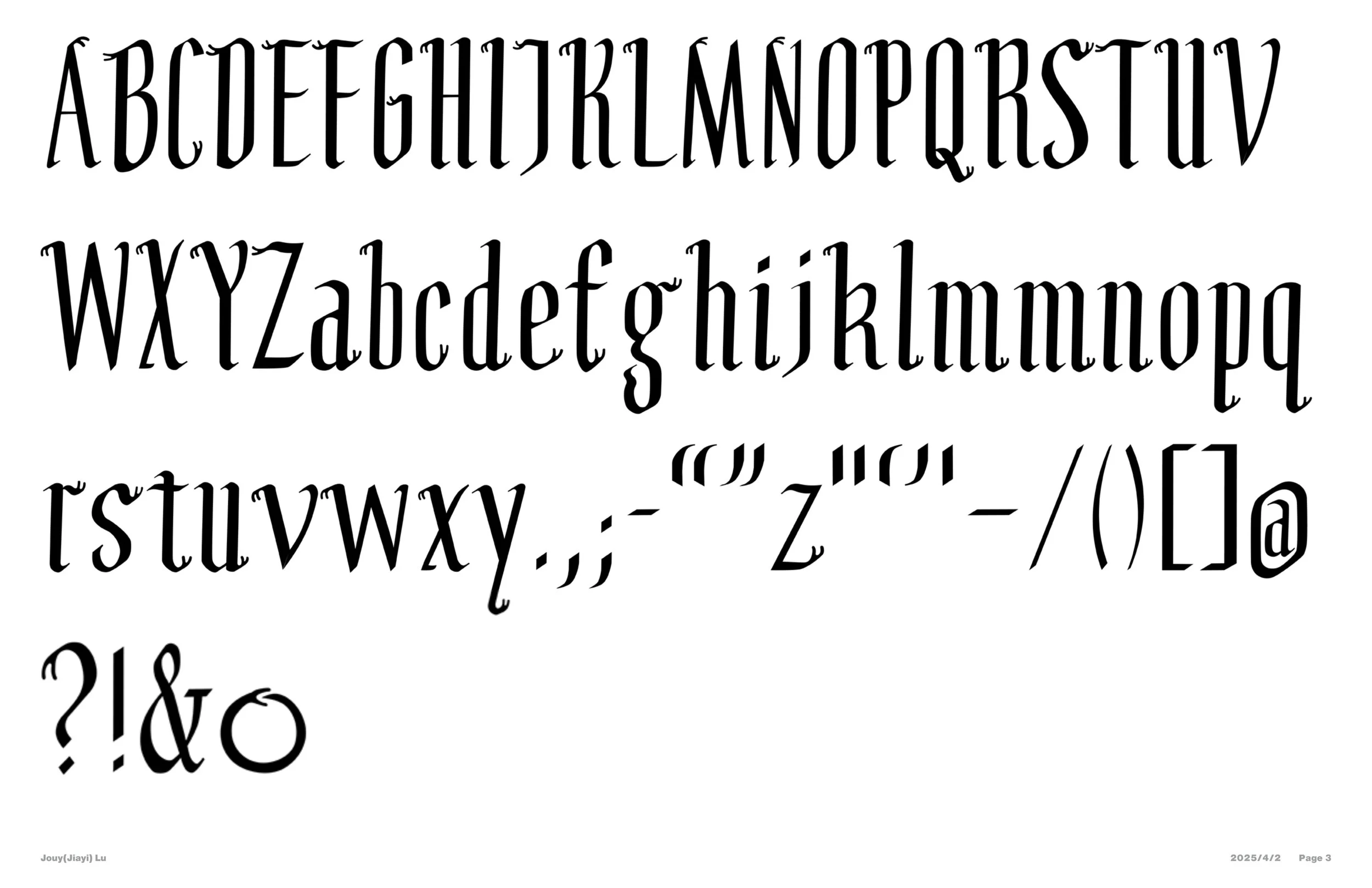
OPHIS SERIF
Inspired by the sleek, fluid motion of snakes, this typeface captures their flexibility and the sharp flicker of their tongues. Designed for magazine titles at 150pt and viewed from a typical reading distance, it features elongated ascenders and descenders, a bold weight, high contrast based on broad-edge nib strokes (translation contrast), a condensed width, and distinctive serif endings.
I also designed a playful little website for this font.
If you're on a laptop or computer,
feel free to check it out!
https://jouylu.github.io/typeface-microsite/
hand-drawn draft

Presentation